
Conversion Focused Landing Page
Mobrog is an online survey platform where users can participate in paid surveys and share their opinions on a variety of topics. By completing surveys, users earn rewards, making it a convenient and engaging way to contribute to market research while gaining incentives.
I worked on the redesign of the website landing page. The goal was to enhance the user experience and improve the visual appeal of the website. I focused on creating a modern, user-friendly design that would be accessible across all devices, including desktop, tablet, and mobile. The redesign aimed to streamline navigation, increase engagement, and ensure that the page effectively communicates the platform’s value to its users.
Role
Website Redesign
Category
B2B, Online Surveys
Platform
Figma and Adobe AI

Design Breakdown
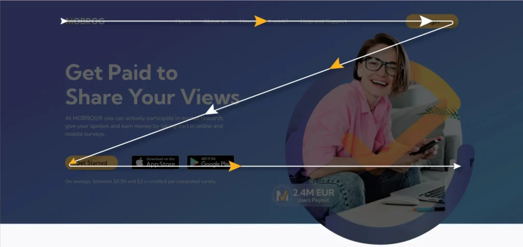
Z-pattern layout
In the hero section of the redesign, I implemented a Z-pattern layout to guide users through the page in a natural and intuitive way. This layout takes advantage of users’ natural eye movement, starting from the top left, moving across the top, then diagonally down to the bottom left, and finishing across the bottom.

Clear and Compelling Headline
For the headline copy, I proposed some value-driven headline instead of a current generic heading.
- – Profit from Your Perspective
- – Cash Rewards for Your Feedback
- – Your Opinions, Your Earnings
- – Make Money with Easy Surveys
Key Visual
I designed the key visual for hero section featuring a girl with a cheerful expression, holding a mobile phone and a laptop (indicating MOBROG available as mobile app and web app). This visual indicates her satisfaction with using the survey platform.
The entire imagery is framed within a checkmark symbol, commonly associated with surveys and forms, reinforcing the idea of a positive and approved experience.
Action-Oriented CTAs
I included strong CTAs and social proof elements prominently in the above-the-fold section. A “Get Started” CTA and app download buttons make it easy for users to begin, while a concise credibility statement reinforces trust and highlights average earnings of $0.50 to $3 per survey.

Listing Key Benefits
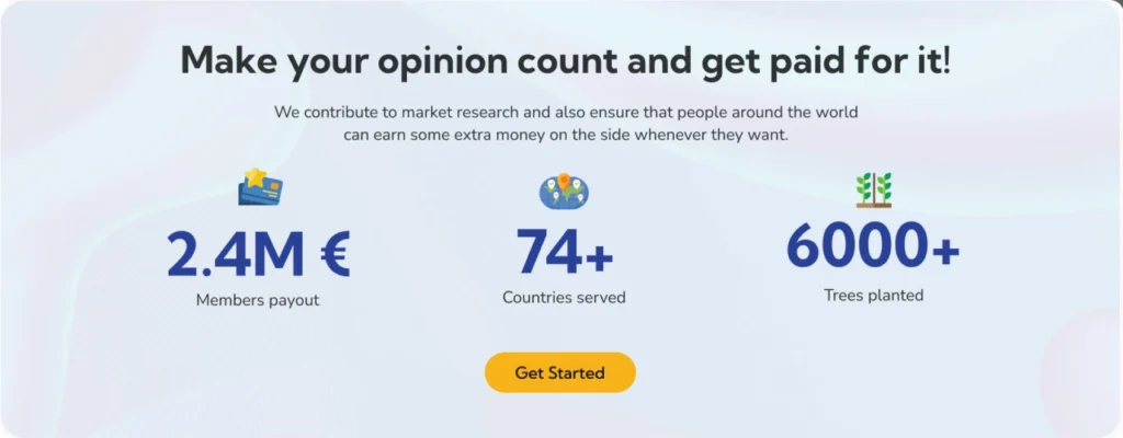
Highlighting “A Year with MOBROG” just below the hero section, along with bold typography for numbers and vibrant icons, to build credibility and driving conversions. This approach leverages concrete metrics—like €2.4M in member payouts, 74+ countries served, and over 10,000 trees planted—to create instant trust and showcase MOBROG’s impact and global reach.
How it works
I included a clear “How it Works” section that outlines the three main steps users need to take, each with a concise heading and description.
A “How it Works” CTA links to a dedicated page where each step is explained in detail, guiding users with ease.

CTA to Drive App Downloads
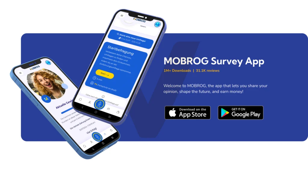
This placement of Call to action reinforces the app’s value by demonstrating its popularity and credibility to build trust and motivate immediate action.
Engaging Visuals to support the context
The visuals used “Your Rewards” and “Our Promises” are tailored to complement and enhance the context of the body copy.
In the last I included a reminder of the next step with a prominent, action-oriented CTA like “JOIN NOW” or “GET STARTED,” keeping the focus on motivating users to take action. Additionally, I showcased the MOBROG app on both mobile and laptop screens, providing users with a clear sense of its functionality and ease of use across devices.

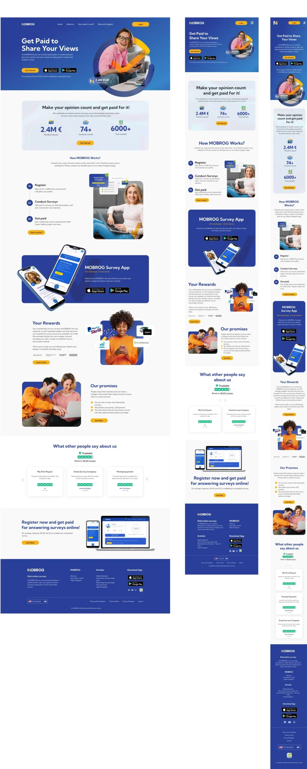
Optimized for Every Screen
Ready to Bring Your Vision to Life?
© 2024-25 Sidra Rehman – All Rights Reserved
